Visualization Episode 2
We all know how to specify a table and our processes support this. However, designing an awesome data visualization does not work this way. Our approach to table specification does not work?
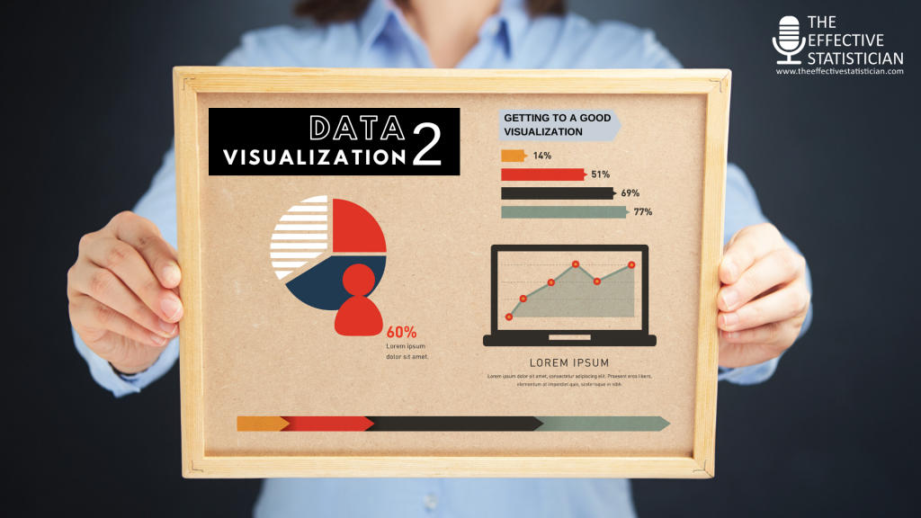
In this second episode. I talk about how you can create a great visualization. Here are the following important tips I’m speaking about:
- Importance of details
- Co-creation with the audience
- KOL engagment
- Multiple review rounds
- Testing and refinement
- Start with pen and paper
- Focus on the larger topics like which plot to use first and then fine-tune to a more detailed level taking care of
- Use of colour
- Title
- Labels, legends
- Alignment
- Footnotes
- Supporting text
- For dashboards set up
- Filter and sorting options
- Arrangement of multiple displays
- Highlighting options
- Hover over options
- Digging deeper options
- Encouraging and giving feedback
Listen to this episode and share this with your friends and colleagues who might benefit from it!
Never miss an episode!
Join thousends of your peers and subscribe to get our latest updates by email!
Get the